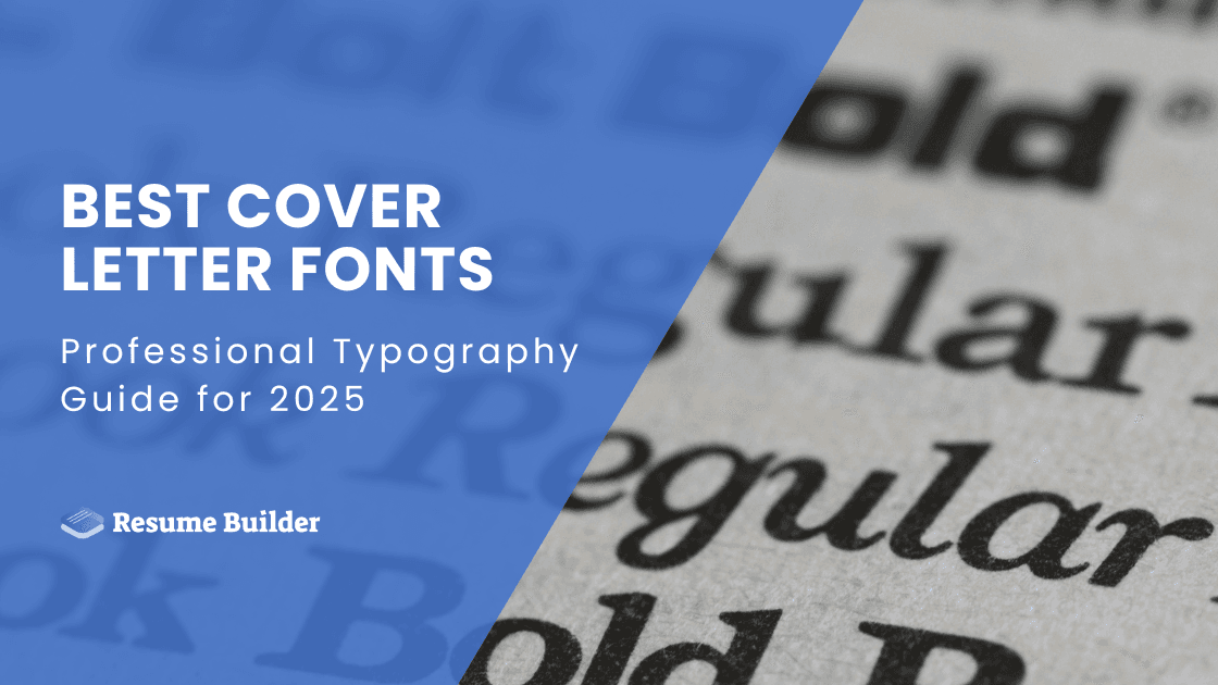
Best Cover Letter Fonts: Professional Typography Guide for 2025
Your cover letter font choice can significantly impact how hiring managers perceive your professionalism. The right typography demonstrates attention to detail and ensures your message is clearly communicated; a bad one, on the other hand, might ruin your chances of being called for an interview.
This article will be your guide to choosing the appropriate cover letter font; we’ll explain what options are considered the best by recruiters, explain why, and offer some extra advice on polishing your formatting.
- The best cover-letter fonts balance professionalism, readability, and ATS compatibility; classics like Times New Roman, Calibri, Arial, and Georgia are strong choices.
- A good font should be clean, widely available, and maintain clarity at 10–12 pt—with 11 pt being ideal for most situations.
- Consistency is key: use one font family across your cover letter (and preferably your résumé) while keeping spacing, margins, and formatting clean and simple.
- Common mistakes include using decorative/novelty fonts, mixing multiple font families, extreme font sizes, poor contrast, and excessive styling.
- The right typography enhances professionalism and helps hiring managers focus on your qualifications, which improves the overall first impression.
What Makes a Good Cover Letter Font?
A good cover letter font strikes a balance between professionalism, readability, and compatibility with applicant tracking systems (ATS). Its purpose is to convey competence and attention to detail while ensuring your content is easily digestible for hiring managers who review dozens of applications daily.
The ideal job application font should be clean, simple, and widely available across different operating systems. It must maintain clarity at standard business font sizes (10-12 points) and work well in both digital and printed formats. Additionally, the font should complement standard business communication practices and align with the expectations of your industry.
You should also consider factors like letter spacing, character width, and overall legibility when making your selection. The font should enhance your message rather than distract from it and create a seamless reading experience that keeps the focus on your qualifications and enthusiasm for the position.
8 Best Cover Letter Fonts for Professional Applications
The best cover letter fonts for professional applications include:
Times New Roman remains the gold standard for business documents and correspondence, including cover letters. This serif font projects traditional professionalism and is universally recognized across industries. Its classic appearance works particularly well for conservative fields, such as law, finance, and government positions.
The font's excellent readability at standard sizes (11-12 points) makes it ideal for both digital submission and printed applications. Plus, it’s pre-installed on virtually all computers, ensuring a consistent appearance regardless of the recipient's system, and its balanced character spacing prevents cramped text while maintaining professional density.
This font pairs exceptionally well with traditional resume formats and demonstrates respect for established business communication standards. However, some modern companies may perceive it as slightly outdated, which is why it’s important to research a business/corporate culture.
Arial offers a clean, modern alternative to serif fonts while maintaining high professional standards. It provides excellent screen readability, which makes it perfect for digital applications and email submissions, and its straightforward appearance works well across all industries, from creative agencies to corporate environments.
The font's wide character spacing enhances readability, particularly beneficial for applicants whose first language isn't English. The neutral appearance allows your content to take center stage without typographical distractions; at 11-12 points, it maintains clarity without appearing too large or casual.
Finally, Arial is an ATS-friendly font, widely supported across platforms, which ensures your cover letter appears as intended. It pairs well with most resume formats and creates a cohesive application package, while its versatility makes it an excellent choice for career changers or those applying across multiple industries.
Calibri has become the modern standard for business communications, serving as Microsoft Office's default font since 2007. This contemporary sans-serif font offers a perfect balance between professionalism and approachability, which is why it’s ideal for startups, tech companies, and progressive organizations.
Its rounded edges create a friendly yet professional appearance that appeals to modern hiring managers, and its excellent spacing and clarity at smaller sizes (10-11 points) allow for more content while maintaining readability. Calibri works exceptionally well for digital applications and demonstrates familiarity with current business communication trends.
This font is particularly effective for younger professionals and those entering modern industries where traditional formality is less emphasized. Its widespread adoption in business environments makes it a safe, contemporary choice that won't appear dated or overly casual.
Garamond offers an elegant serif option that stands out from typical Times New Roman while maintaining classical professionalism. This font is particularly favored in publishing, academia, and creative industries where sophistication and attention to typography rules are valued.
The font's narrow character width allows for more text per line, making it efficient for comprehensive cover letters. Additionally, its distinctive appearance demonstrates typography awareness while remaining highly readable; at 11-12 points, it provides excellent clarity and maintains professional standards.
It works particularly well for positions requiring attention to detail, such as editorial roles, design positions, or academic appointments. However, ensure your target organization appreciates typographical sophistication before choosing this more distinctive option over safer alternatives.
Specifically designed for screen reading, Georgia is perfect for digital cover letter submissions. It combines traditional professionalism with modern functionality and offers excellent readability across all devices and platforms.
A larger x-height and open letterforms it boasts ensure clarity even at smaller sizes, which is why it’s ideal for writing comprehensive cover letters. Meanwhile, this font, along with a proper cover letter design, maintains legibility when printed or viewed on various types of screens, ensuring consistent presentation.
Georgia particularly appeals to organizations that value both tradition and technological adaptability. It works well for communications, education, and consulting roles where clear correspondence is paramount. Plus, it demonstrates understanding of digital communication needs and maintains professional standards.
Helvetica is renowned for its clean, minimalist appearance and exceptional readability. This classic sans-serif font is particularly popular in design, advertising, and creative industries where visual aesthetics matter; plus, its neutral character makes it suitable for virtually any professional context.
Here, the uniform stroke width creates outstanding clarity at all sizes. Helvetica's timeless design has remained relevant for decades, demonstrating both classic appeal and contemporary relevance. It works exceptionally well for companies emphasizing innovation, creativity, or modern design sensibilities.
However, it may not be available on all systems, potentially causing substitution with similar fonts that could alter your document's appearance. You should consider your submission method and the recipient's likely system capabilities when selecting this option.
Trebuchet MS offers a friendly, approachable alternative to more formal fonts while maintaining professional standards. This sans-serif font works particularly well for positions in education, healthcare, social services, and other people-focused industries where approachability is valued.
The font's distinctive character shapes and generous spacing create excellent readability and project warmth and accessibility. Therefore, it performs well in both digital and print formats, ensuring consistent presentation across different media; at 11-12 points, it appears more conversational than traditional professional fonts.
This font choice demonstrates personality while respecting professional boundaries, so it’s ideal for roles requiring interpersonal skills. However, it’s best to research your target company’s norms to ensure this friendlier approach aligns with organizational expectations.
This font provides a distinctive serif option that conveys sophistication and literary awareness. This font is particularly effective for positions in publishing, education, libraries, and other fields where classical knowledge and attention to written communication skills are valued.
Book Antiqua’s elegant letterforms and excellent readability make it suitable for formal business correspondence and help you stand out from more common choices. The font works well at 11-12 points and maintains clarity in both digital and printed formats.
You can consider it for organizations that value traditional scholarship, attention to detail, and sophisticated communication. However, ensure your industry and target company appreciate distinctive typography choices before selecting this more uncommon option over widely accepted alternatives.
Cover Letter Font Size Guidelines
Selecting the appropriate font size is crucial for creating a professional, readable cover letter that respects hiring managers' time and visual comfort. Let’s see what font sizes match specific types of cover letters or specific occasions:
- 10-point font works well for longer cover letters or when using fonts with larger character sizes, such as Georgia. This size allows more content while remaining readable, but ensures adequate line spacing to prevent a cramped appearance.
- 11-point font represents the ideal middle ground for most cover letter formats. This size provides excellent readability while maintaining a professional appearance and allowing sufficient content coverage.
- 12-point font offers maximum readability and works particularly well for serif fonts or when targeting older hiring managers. However, this larger size may make your cover letter appear longer and potentially reduce content density.
Avoid sizes below 10 points as they strain readers' eyes and may appear unprofessional. Similarly, sizes above 12 points can appear childish or suggest difficulty filling the page with relevant content.
Furthermore, consider your chosen font's characteristics when selecting size. Fonts like Times New Roman appear smaller at the same point size compared to Arial or Calibri. Test different combinations to find the optimal balance between readability and professional appearance.
Finally, you should maintain consistency with your resume font size to create a cohesive application package. If using different fonts for variety, you need to make sure both documents maintain similar visual weight and professional appearance.
7 Top-Notch Tips for Proper Cover Letter Font Formatting
Proper cover letter formatting extends beyond font choice to encompass spacing, alignment, and overall document structure. Here are some tips you should have in mind when tackling this aspect of your cover letter:
- Use 1.15 to 1.5 line spacing for optimal readability, as this won’t make your cover letter appear too sparse. Single spacing can appear cramped, while double spacing wastes valuable space and may seem unprofessional in business correspondence.
- Add 6-12 points of space between paragraphs to create clear visual breaks without excessive white space. This spacing helps guide readers through your content while maintaining professional density.
- Maintain 1-inch margins on all sides to ensure proper framing and printing compatibility. Use left alignment for body text, as full justification can create awkward spacing and reduce readability.
- Use the same font family throughout your cover letter, varying only in weight (bold for your name/contact information) or style (italics for emphasis, used sparingly). Avoid mixing multiple font families, which appears unprofessional and
- Bold your name and contact information at the document header. Use bold sparingly within the body text for critical information like company names or job titles. Avoid underlines, which can appear outdated, and excessive italics, which reduce readability.
- Ensure your formatting translates well through applicant tracking systems (ATS) by avoiding complex layouts, text boxes, or unusual formatting that could confuse parsing software. Stick to standard business letter fonts and formatting with clear section breaks.
- Test your formatting by converting your document to plain text to ensure content remains coherent and properly ordered for ATS systems.
5 Common Cover Letter Font Mistakes to Avoid
Recognizing common font mistakes helps you avoid pitfalls that could undermine your professional presentation and reduce your chances of landing interviews. Let’s see what they are:
Mistake: Choosing fonts like Comic Sans, Papyrus, or script fonts for perceived creativity or personality.
Impact: These fonts appear unprofessional and suggest poor judgment in business communication.
Solution: Reserve creative fonts for other, more appropriate contexts and stick to business-standard options for job applications.
Mistake: Mixing multiple font families within your cover letter or between the cover letter and resume.
Impact: Creates a disjointed appearance and suggests a lack of attention to detail.
Solution: Choose one primary font family and maintain consistency throughout all application materials.
Mistake: Using font sizes below 10 points or above 12 points for body text.
Impact: Small fonts strain readers' eyes; large fonts appear unprofessional or suggest insufficient content.
Solution: Stick to 10-12 point range and test readability across different devices and print formats.
Mistake: Using light gray text, colored fonts, or low-contrast combinations for body text.
Impact: Reduces readability and may not print or display properly across different systems.
Solution: Use black text on white backgrounds for maximum clarity and universal compatibility.
Mistake: Excessive use of bold, italics, underlining, or color variations.
Impact: Creates a cluttered appearance and distracts from content quality.
Solution: Use formatting sparingly for emphasis and maintain a clean, professional presentation.
Final Thoughts
Selecting the right cover letter font is a subtle but powerful way to demonstrate professionalism, attention to detail, and knowledge of business communication standards. As you could see in this guide, the best choices balance readability, professional appearance, and technical compatibility.
Take time to test your font choice across different viewing scenarios and ensure it creates the professional impression you want to make. Your thoughtful attention to these details reflects the same care you'll bring to your potential role!
Cover Letter Font FAQ

Daniel Carter is the salary negotiation coach you wish you had before accepting that lowball job offer. With years of HR experience, he knows all the employer tactics—and how to counter them. His posts break down negotiation strategies, industry salary trends, and scripts you can actually use in real conversations.
