Resume Design Guide: Tips and Tricks That Really Work

Resume design refers to the way a resume looks and how your information is visually organized. It includes layout, font choice, spacing, section order, and the overall balance between style and readability. The best designs make your experience easy to follow, guide the reader’s eye to key details, and support your content instead of competing with it.
In this article, you’ll learn what makes a resume design effective, which design choices help or hurt your chances, and how to strike the right balance between professionalism and personality. You’ll also find out how to choose a layout for your industry, avoid common design mistakes, and create a resume that looks polished without sacrificing clarity or ATS compatibility.
- Resume design is the visual presentation of your resume, including layout, fonts, spacing, section order, and hierarchy, and it should make your content easy to scan rather than just look attractive.
- Professional resume design must work for both human recruiters and ATS software, which means it needs to be clear, professional, readable, and structured in a way that software can parse correctly.
- The strongest resume design tips revolve around a suitable layout, readable fonts, balanced white space, clear visual hierarchy, limited color use, and formatting that matches your industry.
- Common design mistakes, such as cramped pages, unreadable fonts, photos, text boxes, tables, graphics, and inconsistent formatting, can hurt both readability and ATS performance.
- The most creative resume design isn’t always the best, because the right approach depends on your field and experience level.
What Is Resume Design?
Resume design refers to the visual structure, layout, formatting choices, and aesthetic decisions that determine how a resume looks and how information flows on the page. It's the difference between a document that communicates competence at a glance and one that makes a recruiter work to find what they need.
It helps to separate design from content:
- Content is what you say and typically entails your experience, skills, and achievements.
- Design is how you present that content and includes the font you choose, white space, columns, colors, and visual language application.
Design decisions affect two very different audiences. Human recruiters respond to scannability, professionalism, and visual clarity, while applicant tracking software (ATS) responds to parsability (extracting your information cleanly from the document's structure). Needless to say, strong resume design satisfies both simultaneously.
The goal is to create a clear, professional, and purposeful document that makes it easy for the right person to see why you're the right candidate.
Why Does Resume Design Matter?
Resume design matters because hiring managers form an opinion about a candidate within seconds of viewing their document. That first impression shapes how they read everything that follows.
An eye-tracking study found that recruiters follow a predictable scanning pattern, focusing first on name, job title, company names, dates, and education. Everything else is secondary.
So, a well-designed resume places this information exactly where a recruiter's eye expects to find it and makes the scan fast and the impression strong. On the other hand, a poorly organized document forces the recruiter to search, and most won't bother.
The second audience is applicant tracking software (ATS). Over 90% of Fortune 500 companies use ATS for resumes before a human ever sees them. These systems parse your application for keywords, dates, and structured information.
Design elements like text boxes, tables, headers, footers, and embedded graphics can break that parsing entirely, which means a beautifully designed resume never reaches the human stage.
Therefore, a goal of good resume layout is to guide the reader's eye to the most important information while keeping the document machine-readable. Knowing how to write a resume with strong content is the foundation, but the design is what gets that content seen.
How to Design a Resume in 6 Easy Steps
You can design a resume step by step by starting with a template, organizing your sections, choosing a readable font, and customizing the layout to your industry and experience level. The process is more systematic than most people expect and significantly faster when you start with a well-built foundation.
A pre-built template saves time and ensures professional proportions from the outset, as margins, font sizing, spacing, and section structure are already calibrated.
If you're building from scratch, establish your design system before writing a single word: set margins, choose your fonts and sizes, and define your header styling. Making these decisions up front prevents inconsistency later.
The standard section order for most resumes is:
- Contact information
- Professional summary or objective
- Work experience
- Education
- Skills
- Optional sections (certifications, publications, languages, volunteer work)
Lead with the sections most relevant to your career stage; a recent graduate might move Education higher, while a senior professional might lead with a strong resume summary that immediately establishes seniority.
Set your fonts, sizes, and line spacing consistently before filling in content; establish one style for section headers and apply it uniformly. Also, decide on your bullet point style (a simple dash or filled circle) and don't change it; consistency at this stage prevents the formatting patchwork that makes a resume look hurriedly assembled.
Bold your job titles and company names (this part should be the largest element on the page), and ensure section headers are visually distinct from body text through size, weight, or color. The hierarchy should make it possible for someone to identify your most recent employer and the dates of employment within two seconds of looking at any given section.
Copy and paste your resume text into a plain .txt file. If the content reads cleanly (in the right order and with no scrambled columns or missing information), your document will likely parse correctly through ATS.
If text from your sidebar appears mid-sentence in your experience section, the layout has a parsing problem that needs fixing before you apply it anywhere.
Ask a trusted peer (ideally someone in your industry) to review the document cold and tell you what they notice first. Their answer tells you whether your visual hierarchy is working.
You should also download it in the format the employer requests; when no format is specified, .pdf preserves your formatting across devices, while .docx is safer for ATS submission.
7 Resume Design Principles to Follow
The following resume design principles apply regardless of whether you're creating a simple one-page document or a multi-page senior executive resume:
#1. Choose the Right Resume Layout
Your resume layout is the foundational decision everything else builds on, and the right choice depends on your industry, experience level, and how you're submitting the application.
Single-column layouts are the most ATS-safe option; the content flows in a single vertical stream that parsing software reads reliably from top to bottom. They're the standard choice for traditional industries like law, finance, government, and healthcare, and the safest bet any time you're applying through an online portal.
Meanwhile, two-column layouts create more visual impact and allow you to use space more efficiently, which can be an advantage for creative and tech roles.
The risk is ATS compatibility: some systems read both columns simultaneously and jumble the content entirely. Hybrid layouts blend elements of both: a narrower sidebar for contact details or skills alongside a wider main column for experience, and can work well when you're confident the ATS can handle it.
Whatever layout you choose, it should match industry expectations; for example, a graphic designer's resume can afford more structural flair than an accountant's.
#2. Use the Right Resume Fonts
The right fonts for resume design are professional, highly readable typefaces that display cleanly on screen and in print, and that ATS systems can parse without errors.
The most reliable choices here include Calibri, Garamond, Georgia, Helvetica, Arial, and Cambria, as these are professional, widely supported, and ATS-safe. For sizing, your name and header should sit between 14–16pt, section headings at 11–12pt bold, and body text at 10–11pt.
At the same time, you should avoid decorative, script, or novelty fonts entirely since they reduce readability for human eyes and often cause ATS parsing failures. Limit yourself to two font families at most: one for headings, one for body text. Mixing more than two creates visual noise without adding value.
The most important rule is definitely legibility as a priority.
#3. Master Resume Margins and Spacing
White space is one of the most powerful tools in resume design, and most people use far too little of it. Typography research suggests that readable text settings, including appropriate spacing and familiar/well-optimized typefaces, can improve legibility and sometimes reading speed or processing efficiency.
Standard margins should sit between 0.5 and 1 inch on all sides, while line spacing for body text works best at 1.15–1.5. Adequate spacing between sections gives each block of information room to breathe and makes the document faster to scan.
The temptation to shrink margins and reduce spacing to squeeze everything onto one page is understandable. Yet, a cramped resume that technically fits one page reads much worse than a clean, well-spaced document that runs slightly longer. So, readability is never worth sacrificing for the sake of an arbitrary page count.

#4. Create a Strong Resume Visual Hierarchy
Visual hierarchy means designing the document so the reader's eye naturally moves from the most important information to the least without having to decide where to look next.
You can achieve this through size, weight, and spacing. Your name should be the largest element on the page, while section headers should be clearly larger or bolder than body text. Also, job titles should stand out from company names, and body text bullets should be consistent in size and indentation throughout.
Bold is your primary tool for signaling importance within a section, so you can use it for job titles, company names, and key terms, but avoid doing it randomly, or it loses its meaning.
Consistent header styling lets recruiters scan and locate sections instantly, which matters enormously in a six-second first pass. Bullet points should follow a parallel structure (same grammatical form and similar length) so that the eye can move down the list without stopping to reorient.
#5. Use Color Strategically
A single accent color can add professionalism and visual interest to a resume without distracting from the content, but the key word is single.
Navy, dark teal, charcoal, or burgundy are strong choices for this, as they're distinctive without being “loud”, and they work across most industries. Color should be used structurally: to highlight your name, section headers, or dividing lines, and it shouldn’t be scattered decoratively throughout the document.
Logically, you must steer clear of bright or neon colors, as well as multicolor schemes. Both can look amateurish and may not reproduce cleanly when printed or converted to greyscale. For conservative industries (law, finance, government, academic institutions, etc.), stick to black and white, or introduce color so subtly it reads as a design choice rather than a style statement.
#6. Keep It ATS-Friendly
ATS-friendly resume design means structuring your document so that parsing software can extract your information accurately, in the right order, without gaps or scrambled content.
Specific elements to avoid include:
- Text boxes (ATS systems often skip them entirely)
- Tables used for layout (content gets read out of sequence)
- Headers and footers for important contact information (some ATS systems don't read these)
- Graphics
- Icons with embedded text
You need to use regular section headings rather than unique alternatives; standard labels are what ATS systems are programmed to recognize. It’s also recommended to save your resume as .docx or .pdf, depending on what the employer specifies; when in doubt, .docx is the safer default for ATS compatibility.
#7. Tailor the Design to Your Industry
The design choices that work for a UX designer's resume are not the same ones that work for a corporate lawyer's, and submitting the wrong aesthetic for your field can undermine a strong application before anyone reads a word.
Creative fields (design, advertising, media, fashion, etc.) allow and in some cases expect more visual personality. A two-column layout, a color accent, and custom section icons can all work well and signal design awareness.
Yet, traditional fields, such as law, finance, healthcare, and government) expect single-column formatting, conservative fonts, and black-and-white or near-monochrome color schemes. Anything more elaborate reads as a lack of professional judgment.
Tech and startup roles sit between the two: clean and modern resume design works well, with a clearly defined skills section carrying more weight than visual flair. And finally, academic and research CVs operate on different norms entirely and are longer, more detailed, and minimally designed.
Resume Design Mistakes to Avoid
The most common resume design mistakes include overcrowding the page, using unreadable fonts, and relying on design elements that confuse ATS software, often in combination.
- Using tables or text boxes for layout: this breaks ATS parsing and often causes content to appear out of order or disappear entirely.
- Including a photo: unless it's standard practice in your target country or industry (it is expected in some European markets; it is actively discouraged in the US, UK, and Canada)
- Using a generic, outdated template: a document that looks like thousands of others, signals low effort, regardless of the content inside.
- Inconsistent resume format/formatting: mixing font sizes, alternating bullet styles, or using different date formats across sections all undermine the professional impression
- Over-designed resume color schemes: multiple accent colors, decorative borders, or gradient backgrounds distract from content and can look amateurish
- Tiny font sizes to cram content: readability always outweighs fitting everything on one page; 9pt body text does more harm than good
Resume Design Ideas: Resume Examples by Style
Popular resume design ideas range from minimalist single-column layouts to bold two-column formats with color accents. The right choice depends on your industry, experience level, and the impression you want to make.
That said, let’s examine different resume examples by style so you can see which works best for you:
Simple Resume Example

Modern Resume Example

Creative Resume Example

ATS-Optimized Resume Example

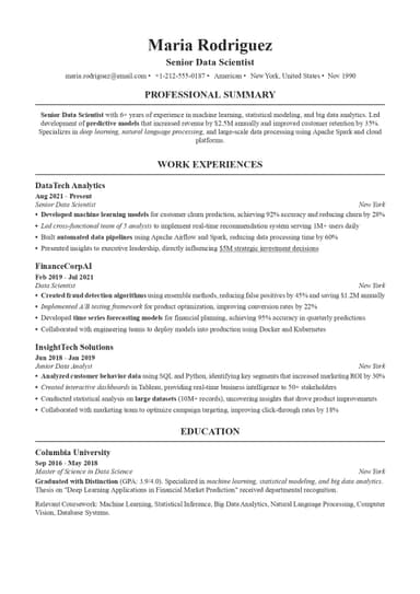
Plain single-column, standard section headings, no graphics, no tables, no text boxes. The safest choice for any online application.
Executive Resume Example

Final Thoughts
In conclusion, a good resume design revolves around being clear, professional, and purposeful. Every decision you make, starting from font choice to margin width to accent color, communicates something about how you work and what you value.
To avoid resume design headaches, you can use professionally-designed and ATS-tested resume templates from ResumeBuilder.so. This way, you can focus entirely on showcasing your experience rather than debugging your formatting.
With our user-friendly resume builder, you can start building yours immediately. With all the tools we provide, your job application will look as neat and professional as possible with minimal effort!
Resume Design FAQs

Jordan Lee is your guide to navigating the rapidly changing job market in the age of AI and automation. He dives into how AI is reshaping hiring, the skills of the future, and what job seekers need to do now to stay relevant. If you’re curious about how technology is transforming careers and want to future-proof your job, Jordan’s insights are a must-follow.